How I made a comic book pitch deck
The Mother Funkin' Dead - A horror/comedy/music triptych

As a screenwriter who has worked with producers, I understand the value of providing a visual proof of concept for film projects. Something that you can present to potential investors or studio executives that sparks some excitement as well as further interest. Pitch Decks, which are used for that very purpose, to shine a light on what something could be other than a pdf of a script.
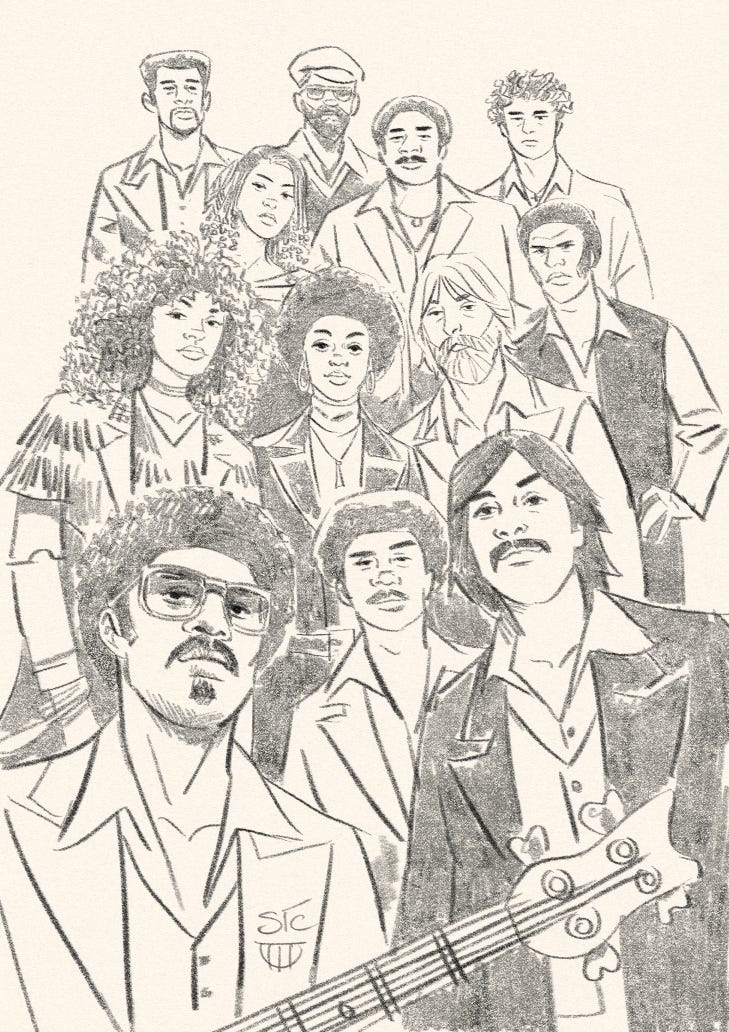
That’s what I was thinking after I wrote my screenplay, The Mother Funkin’ Dead. The comedic/horror thriller centers around a late 70s R&B funk band struggling to survive an outbreak of zombie epidemic while battling their own interpersonal turmoil. For me it was a perfect mashup of stuff I love: funk music, nihilistic zombie horror, 70s nostalgia, with a music bio vibe.

After getting a few notes, followed by a few drafts, I felt it was ready to take out. But ready, how? I have a manager who can send it out as a spec, but my experience is that these scripts that go out from unproduced screenwriters barely make a whimper.
Besides, does the world need another zombie movie, only difference being is that it’s set during the 70s R&B music scene?
In the hypothetical, probably not. But the way I envision it in my warped reality, of course it does!
I wrote this script strictly because I had a bolt of inspiration, and that it has elements of what I love. If you’re a creative person, reading this, I would imagine you can relate.
Because I’ve written and illustrated graphic novels, I thought, why don’t I just do a pitch deck version of it as a comic book. A “floppy,” single issue. Real short. Just the opening teaser of the script.
So, this is what I did. Which is a little different from how I’ve done graphic novels (I’ll get into that process in a later post). With this, since I was the sole writer and illustrator, I didn’t write a graphic novel adaptation of my screenplay, which is what I as well as my writing partner, Jarod Hunter Roe, usually do. Instead, I drew little thumbnail sketches of scene moments, like a storyboard, based on what was written in my screenplay.

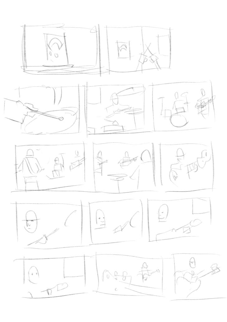
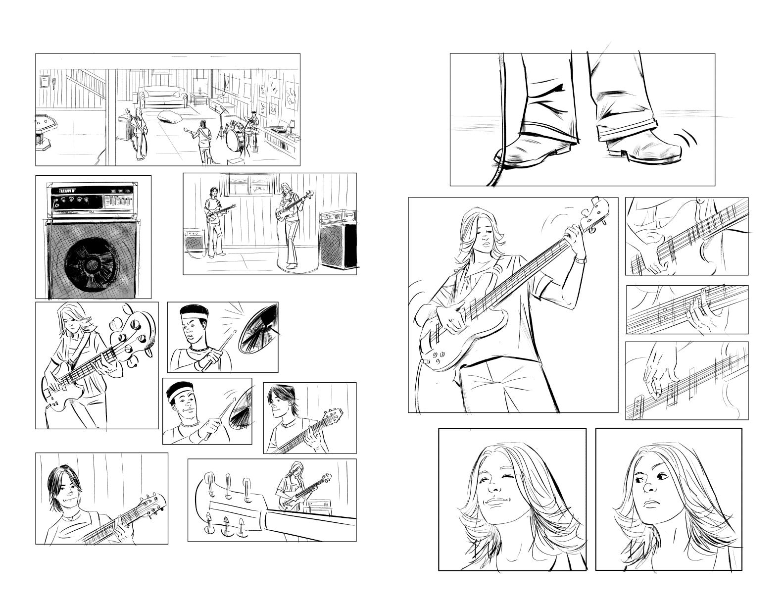
As you can quickly tell, these are really just chicken scratches. It’s the foundation of how I mostly start most of my pages. It’s from these small gestures that I move to the next stage. I did a more fleshed out pass to give a better indication of what was going on.
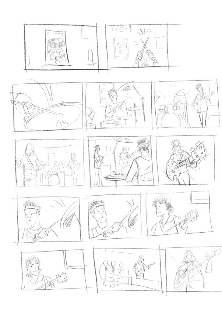
Here you can better make out what’s going on. Next, I broke up the individual storyboard frames and enlarged them into comic book panels. From there, using the rough sketches as my guide, I inked each of the panels. Altogether, this little sequence added up to roughly four pages of comic book content.
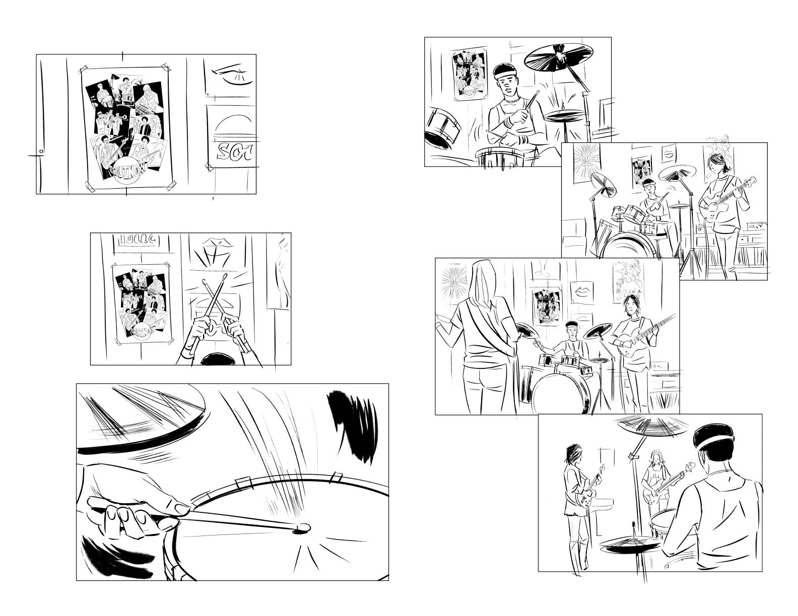
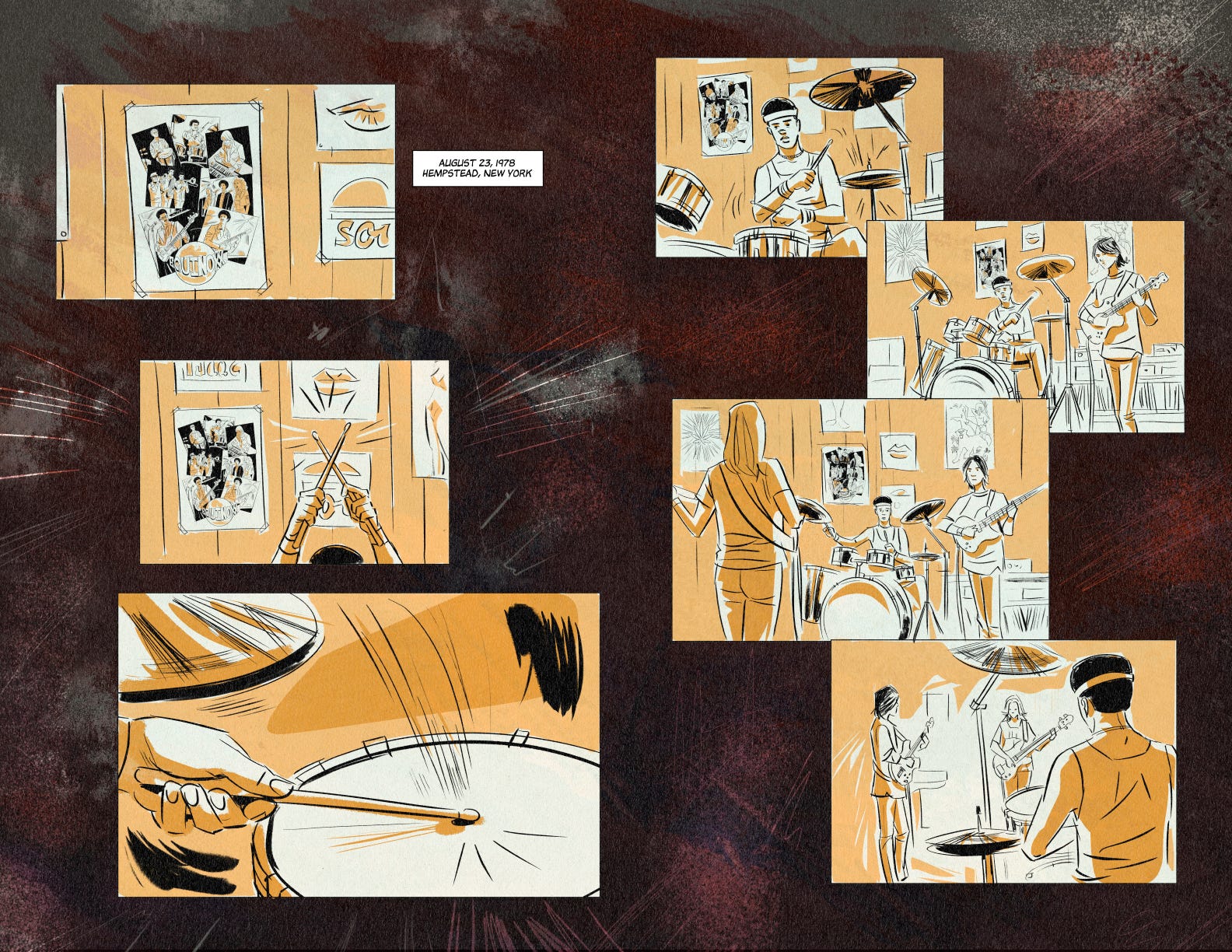
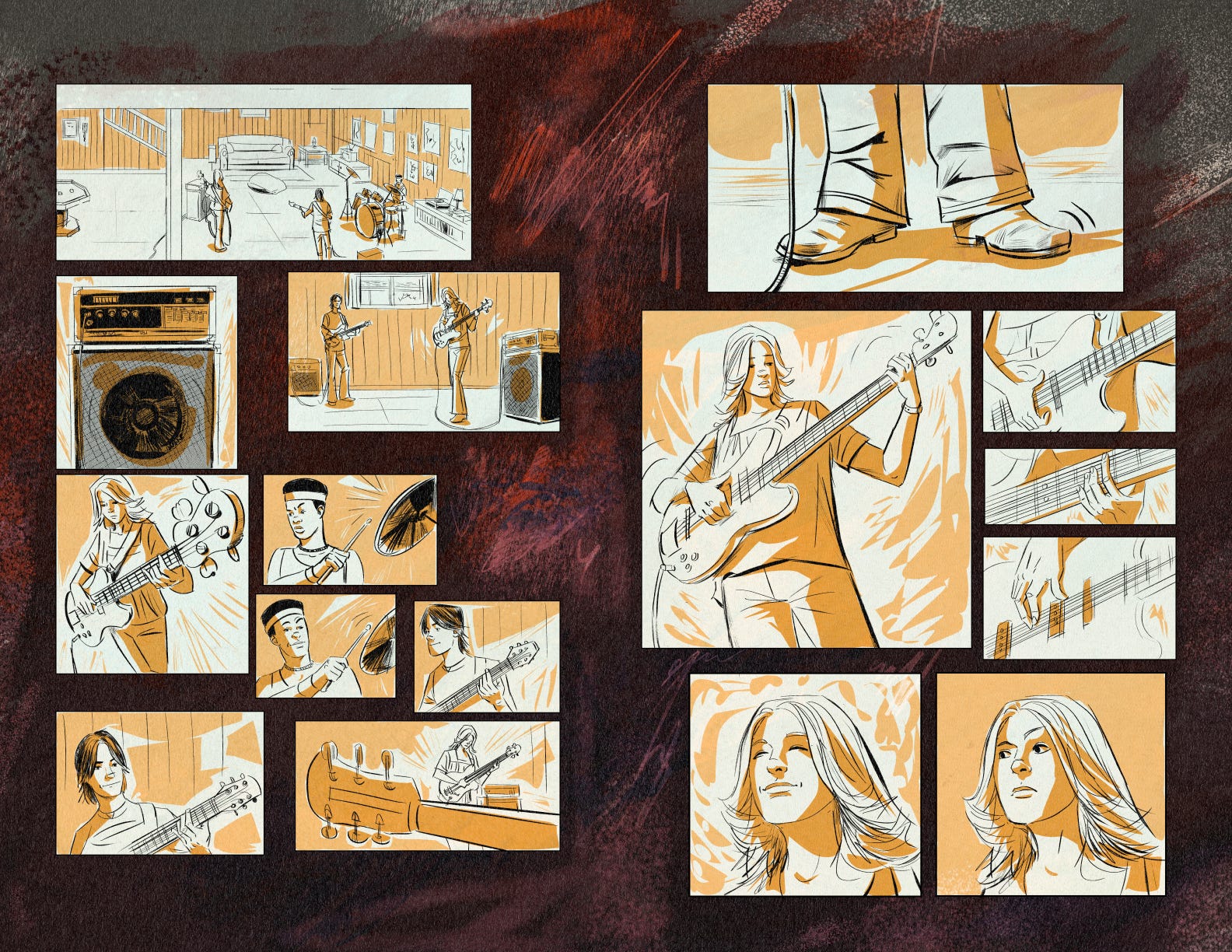
The next pass was to add color and texture. I was going monochromatic with this using just one color. I’m a big fan of this minimalist approach to coloring for certain projects, and decided to apply this. Since I was working in Clip Studio Paint, which is my absolute go to for making comic books, I was able to do my own lettering. I copy and pasted the necessary content from my script, and made the appropriate adjustments. I used a purchased font that I’d gotten from Comicraft. Definitely, check out their library of comic style fonts for your own projects.
Once complete the length of this comic ended up being 17 pages. Since I was going to print it as a comic, I was going to need a cover. After a few iterations I ended up with something I wanted to look as if it were printed in the late 70s. I fashioned my main title to have the feel of a George A. Romero Dawn of the Dead movie with a “Keep On Truckin’,” attitude. It resulted in this…
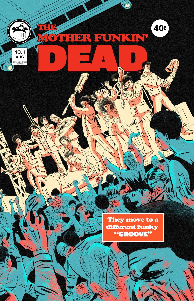
I included my Sic Monkie logo as if it were a comic book publisher. If I can, I try to incorporate my branding when possible.
Once I had all the elements for the book, I sent the files to a company that prints comics. The one I chose was Print Ninja. They’re very affordable and the quality is exceptional––I highly recommend based on my experience.
I went with 15 copies at the ready to show when the moment presents itself. I had a lot of fun making it! I feel that it was a helpful exercise on how to create a “visual aid” for my script as a pitch deck presentation.
For paid subscribers, continue on and you’ll get to see the entire pitch deck comic and the portion of the screenplay that it was adapted from. Look at them both and see how I did a straight from script to comic translation.
Until next time!