


DO NOT DISTURB: Time for the Letters
Part 2

Welcome back. In Part 1, I covered the pencils, inks, and colors used to create our upcoming graphic novel, Do Not Disturb. In this installment, I’ll explain how the book's lettering was accomplished.

Prior to lettering, Jarod and I wanted to make sure our script for the entire book was working as a whole. We turned to our trusted book editor, Barnett Brettler, who edited our previous series, The InSpectres. Barnett is a great writer and is superb at catching inconsistencies, flawed logic, as well as grammatical, punctuation, and sentence structure errors. He’ll also include helpful suggestions, which we always consider, and often use.
Once that’s complete, I prepare the files for our letterer. In this book, we worked with Letter Squids. I discovered this incredible letterer on ArtStation. Incidentally, ArtStation is one of a few platforms I peruse to see what artists, colorists, and in this case, letterers catch my eye.
Since I’m the illustrator of the book, I’ve taken to task what to provide so as to make the lettering process as seamless as possible. What follows is how I do it, and what I’ve discovered works for me.
With regard to the script, I apply numbers to all text that appears as copy in the book: this does not include Panel description since it only serves as stage direction.


Dialogue, Captions, and Sound Effects (SFX) are all enumerated chronologically to provide a road map for the letterer. These numbers represent a pointer to where we would like the text to appear. Using Scrivener as a word processing application comes in handy because there is a graphic novel template that allows for this enumeration. Final Draft does, too, but each page resets back to the number 1, whereas in Scrivener, there is no reset.
This leads me to the guide document I created.
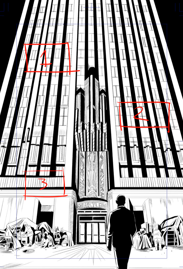

In above example, I go through the entire issue (book), marking up in red on a separate layer, where we feel would be the appropriate location of the text (speech bubbles, captions, SFX). As you might have noticed, the numbers refer back to the numbers from the script. As stated, the red markups are just suggestions. We defer to the letterer, relying on their creativity and skill to place as they see fit.
I compile (export) the script document I created in Scrivener and the visual illustration guide (made in Clip Studio Paint) as two separate pdf files. Initially, I believed that these two documents would suffice, but Letter Squids pointed out that they also needed a Word Doc so as to copy and paste the text from script to the application they use to create the letters. As you’ll notice below, the Word Doc that I created from Scrivener doesn’t include the enumeration––if it did, I likely wouldn’t have to include the additional pdf.


In total, I provided 3 documents and a separate folder that contained low-resolution jpgs of the pages to letter. I uploaded all of this material onto a shared folder that Letter Squids could access.


Letter Squids did their magic and sent low-resolution jpg files for us to review. After the note/revision process, we received the final Adobe Illustrator files (ai). With these files, which were linked to the jpgs I provided, I selected Place… under the File menu in Adobe Illustrator.

Using Place… I link to the 300dpi (higher resolution) tiffs for each page. The result looks like this.

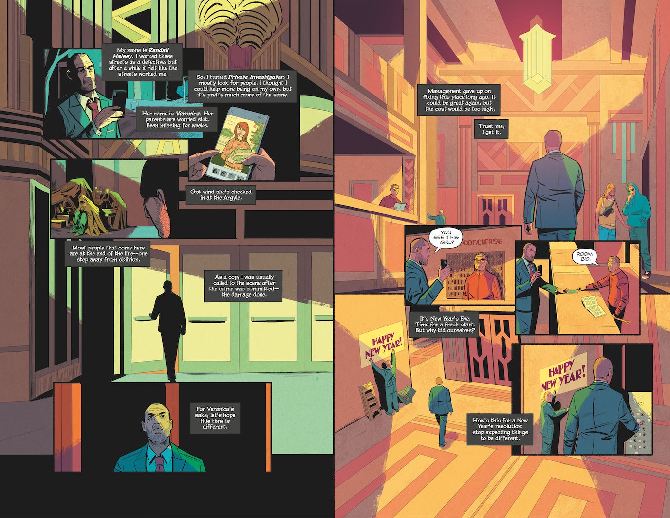
I check them against the approval jpgs Letter Squid sent earlier to see if the letters line up correctly with the art, which, thankfully, it usually does.
We were overwhelmingly pleased with the work Letter Squids did for Do Not Disturb. In several instances, they added creative touches that we hadn’t thought of. Do Not Disturb is in the process of being published by Invader Comics and will be out soon. I’ll be sure to alert you when it does!
Thanks for subscribing!